

The Curly Code

The Curly Code is a Brooklyn-based college prep program using healthy hair knowledge to build college confidence. I was the sole UX Designer with a volunteer design team refreshing The Curly Code’s visual identity (branding and website).
The original site focused on selling The Curly Code branded merchandise. The site was confusing for visitors. They expected to learn how The Curly Code assists students with college prep but found an e-commerce site instead.
Our goal was to transform the website into one that better marketed The Curly Code program and still maintain the e-commerce feature.
Role
UX Designer
User research
Wireframing
Stakeholders
Client (NYC)
3 Graphic Designers (NYC/SF)
Project Manager (SF)
UX Designer (me - NYC)
Tools
Figma
Squarespace
Miro
01 OVERVIEW
About The Curly Code
Challenge
Transform the website to service-focused from e-commerce so potential clients can easily understand the program and its benefits.
Move from Shopify to Squarespace so the client can easily make updates.
Deliverable
First iteration of the website redesign.
Audience
School administrators with a large African-American student population.
Timeline
3 months.
Impact
The new website features content relevant to school administrators. Presented in scannable content chunks, it's easy for them to learn about The Curly Code.
Also, the client shifted to a user-centered mindset as we progressed through this project.
02 DISCOVER
Delivered site. On the homepage we chunked content making it easier for school administrators to understand the program’s benefits.
Define the Audience
The Curly Code serves students BUT needs to market the program to school administrators. At first, the client wanted the site to target both. After learning more about Gen Z and their habits (ex. they are more invested in social), we concluded that school administrators are the primary audience. This also allows the client to maintain two voices - one for the website and a more youth-oriented social presence.
Competitive Analysis and User Research
I prepared a competitive analysis of three educational programs: Mathnasium, Kumon, and Girls Who Code. This helped us understand how they marketed their programs.
I also conducted remote user interviews via Google Meet with two school administrators and one parent.
03 DEFINE
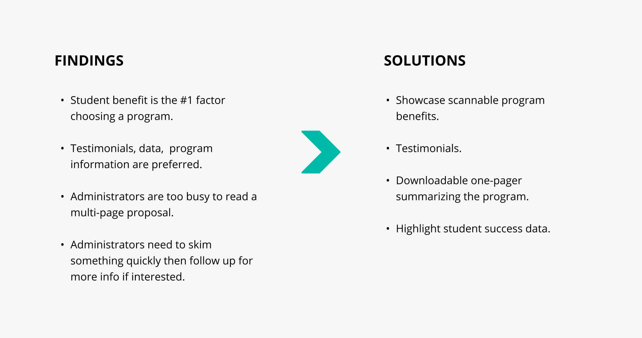
Creating an affinity map helped me consolidate and analyze the findings from the user interviews.
Affinity map
From the competitive analysis and user research findings, the redesign should have a clear way to scan program benefits.
04 DESIGN
The first thing users saw on the old website was the headline "You have entered a store that does quite a lot." Off the bat, it's confusing - is this an educational program that will help my student get into college? Or wait, am I buying something instead?
To reorient the site to be more informational, I reduced the number of navigation items. The new items (What We Do, About, Shop, Resources) are ordered by importance.
Also, I converted the Contact Us link into a CTA button since that's the primary action we want users to take.
Simplified the navigation to 4 items from 7 items used on the old website.
In Figma, I created mid-fidelity wireframes and placed relevant content in scannable chunks.
Homepage redesign: mid-fidelity wireframes
As a remote team, we held internal and client meetings via Google Meet. During our next client sync, I presented the user research and mid-fidelity wireframes.
The client approved the design direction and the lead graphic designer and I started drafting the Squarespace website.
(Left) Homepage redesign v1; (Right) What We Do page redesign v1 - I admit, I did not screenshot this well!
The client was delighted to see the site come alive. One change she wanted was using a form on the Contact Us page. The old site used a 2-page Google form that she wanted embedded on the new site. I mentioned that direct contact info (ex. an email address) is more user-friendly but the client insisted on the form. I decided to choose my battles and accept the request to keep the project moving forward.
05 DELIVER
We knew that school administrators need to quickly find relevant information when they're reviewing potential student programs. The initial design meant extra work for them to learn what the program entails. They'd have to navigate to another page to do this. After discussing this with the client, we collapsed the homepage and the What We Do page for simplicity.
The Shop section maintains the old site’s e-commerce feature but it’s not the primary function now.
Homepage redesign v2
The Shop page carries over the old site’s e-commerce feature.
Our deliverable was the first iteration of The Curly Code redesign and the client was pleased with the redesign. Due to the constraints of using a Squarespace template and the images available for us to work with, there are still some design improvements to do. For instance, the navigation could be more visible. We also noted that the client-provided copy could be more succinct. The client is aware of this and will tackle them as she maintains the site.
06 IMPACT
We transformed the old website into one that better markets and engages potential clients with The Curly Code.
Also, I helped convert the client into a proponent of user-centered design. In the beginning, the client only prioritized the website's visual aesthetic. But after learning about the research findings and through our discussions, she realized UX's value.
The client wanted to use an existing two-page Google form instead of showing direct contact information. But, she realized that as a former teacher herself, even she wouldn't fill out a form, never mind a two-page one. We left the user-friendly direct contact information in. This was a lightbulb moment for her and exciting for me knowing I helped shape how the client appreciated the UX process.